087 711 5767
GU10 is a fitting type, not a brand, and it's the near-universal standard across residential spotlights. This guide covers what to actually buy: 2–10W LED replaces 25–50W halogen at the same brightness, narrow beams for artwork, medium for kitchens, wide for general ambience, and why the same wattage reads brighter with a narrower beam.
Most track spotlights take a standard GU10 bulb, so the brightness and colour you get depends almost entirely on what you fit, not the fixture itself. This guide covers colour temperature by use case (warmer for art, brighter for kitchens), when CRI actually matters, dimming, and genuine styling tricks like using angled light to make a small room feel bigger.
Most reading lamp advice covers placement and type without ever tying either to a number. This is the bridge: 140–170cm height, 3000K rather than 2700K for crisper text over a longer session, and 400–600 lumens, lower than a fully dark desk setup needs, since a reading chair already has some ambient light to work with.
A floor lamp lights more of a room than a table lamp does, so the bulb needs to work harder. This guide covers the real numbers: 60–75W-equivalent (9–12W actual) for general ambient use, whether 800 lumens is actually enough (it depends on the job), and why 3000K isn't "too bright", brightness and colour temperature are two different questions entirely.
The FAQ tells you the shade should sit above eye level when seated, but not what that means in centimetres. Here's the real number: most floor lamps run 140–170cm, clearing the typical 90–100cm seated eye-level line. Plus how to size a lamp against your sofa, whether you need one or two, and the slim-not-short fix for small rooms.
Art Deco fittings are meant to be noticed, which makes them risky to overuse. The trick is one statement piece per room, a sculptural pendant or a backlit mirror, against otherwise plain, contemporary surfaces. This guide covers where the style actually came from, how to style it properly, and the genuinely underused room it works in beyond the entryway and dining table: the bathroom.
Blackened metal and exposed elements are the whole point of industrial style, but overdo either one and a home starts to feel like a co-working space. This guide covers the real fixes: pairing metal with warm or natural materials, varying your metal tones beyond black and grey, and keeping statement fixtures to one or two per room, plus which rooms genuinely suit the style's utilitarian edge.
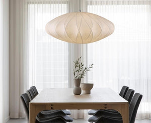
It's not just the pale wood and clean shapes. Scandinavian fittings are engineered specifically to diffuse light and reduce glare, opal glass, fabric drums, and indirect fixtures that scatter light rather than throwing a harsh beam. This guide covers the real technical reason the style feels warm despite running brighter and whiter than Japandi, the exact colour temperature range that makes it work, and how to apply it room by room.